Plotting multiple X–Y data objects with different variables

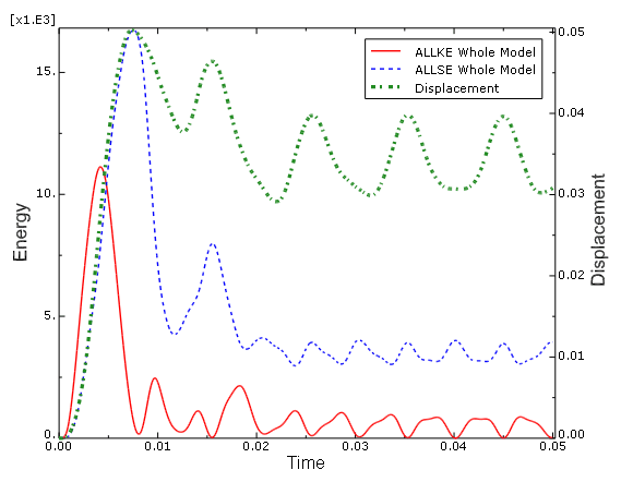
When you plot X–Y data objects with different variables on the same X–Y plot, Abaqus/CAE displays an axis for each quantity type used in these data objects. In the X–Y plot shown in Figure 1, three X–Y data objects are plotted: the ALLKE and ALLSE respectively show kinetic energy and strain energy over time, while Displacement shows displacement of a selected node over time. The resultant plot includes only a single axis, Time, in the X-direction because all three X–Y curves share this quantity type along this axis. In the Y-direction, where these X–Y data objects use different quantity types, the X–Y plot displays separate Energy and Displacement axes.

See Also
Customizing the X–Y plot axis scale
Customizing the X–Y plot axis range
Customizing X–Y plot axis tick marks
Customizing the X–Y plot axis titles
Customizing the X–Y plot axis labels
Customizing the X–Y plot axis color and style
Figure 1. X–Y plot displaying two axes in the Y-direction.

When you plot multiple curves on the same X–Y plot, Abaqus/CAE sets the minimum and maximum values for the plot along both axes to the minimum and maximum values of the first X–Y data object you included in your plot. This X–Y data object is listed first in the X–Y plot legend and in the Curves area of the Curve Options dialog box.

When an X–Y plot displays multiple axes in the X- or Y-direction, you can align them on the same side of the X–Y plot, on opposite sides, or place one or both in the middle of the X–Y plot. You can also manipulate the scale or appearance of these X–Y plot axes independently to make their differences more apparent in the viewport.